Colour for effect
- Comments: 0 in total
- Author:
MyVillage

Colour for effect
Feature
The latest interior colour trends encompass the softest pale shades through to attention-grabbing brights, according to Crown, one of the leading UK paint manufacturers. Texture and contrast continue to be important, with opposite colours and finishes working together to add interest to a room scheme.
Interior designers say we should still be using colour as a means of self expression and a way giving our interiors in a different perspective. Colour can be painted all over in a room, ceilings and woodwork included, to create a calming space. It can also be used more sparingly in vibrant flashes of opposites, or to highlight architectural features.
If you are really keen to be on the ball, there are three colour trends you can aspire to: tension, addition and slow.
The tension palette is largely composed of pale shades, while introducing bold splashes of intensely vibrant colour. Combining different shades of colour in the same room, perhaps on opposite walls, or even using several tones on the same wall, is an easy thing to achieve and live with. The effect in design terms it is warm, sophisticated and luxurious.
Part of the tension palette uses colour as a flash of inspiration. A striking colour, such as royal blue or fire engine red, can be powerfully featured as just a flash or a highlight.
According to the experts, this should be in a position you might not expect, such as a single stair tread, the side of an alcove or the outside edge of a window.
The addition palette began as an architectural trend, but is now being incorporated into interiors. Based on adding colour in a way that is striking because it is so out of scale, addition uses extremes of colour to explore contrast. It’s about having fun with colour and shape, using bright pinks and yellows perhaps, to emphasise and accentuate features in a room.
Architecturally interesting doors or windows are painted in a sunshine shade and then a foot around the wall is painted in a similar colour to accentuate architectural features, making them look bigger than they actually are. This look is bold and liberating, young and stylish.
The slow palette is a gentle effect to counteract the fast pace of modern life. It means shades have a smudge of colour, just enough to make things interesting, but not enough to be definite. Pale lavender, watery blue and pale green can be used inside or out, on walls and ceilings, and can be complemented by beautiful woods and textural fabrics. The same colours are used on walls and wood for relaxing, Zen-like interiors that are the perfect antidote to stress and hurry.
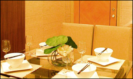
Picture caption: Inner calm – colour can create a gentle relaxed mood.

Interiors
Cosy interior design tricks
Give your room some space
Don't buy furniture on impulse
Colours
Colour for effect
Colour therapy for kitchens
How light affects interior colour schemes
Tips and Tricks
Interior styling for outdoor rooms
See double when decorating
Quick interior design tricks
House and Home
Bring home the finishing touches
Gadget-loving generation
Renovating Britain
UK's Best
New Years Eve Parties
UK's Best
New Years Eve Parties
Find out where to party on NYE


| Book local Hotels | under £40 | from £40 to £60 | from £60 to £80 | from £80 to £100 | over £100 |

